Before I start talking about this project, I want to introduce you to what Yulu is "Yulu is a technology-driven mobility platform that provides seamless first and last-mile connectivity across public and private modes of transport using Micro Mobility Vehicles (MMVs) and a user-friendly mobile app"
Before I start talking about this project, I want to introduce you to what Yulu is "Yulu is a technology-driven mobility platform that provides seamless first and last-mile connectivity across public and private modes of transport using Micro Mobility Vehicles (MMVs) and a user-friendly mobile app"
Before I start talking about this project, I want to introduce you to what Yulu is "Yulu is a technology-driven mobility platform that provides seamless first and last-mile connectivity across public and private modes of transport using Micro Mobility Vehicles (MMVs) and a user-friendly mobile app"
My Role
My Role
My Role
When this project started, ours was a small team of 3 - a UX Designer, a graphics designer & a senior designer. I led the design for the onboarding in 2019 when we were revamping the whole of Yulu app as well as writing the content for the new onboarding as well as doing the UAT for new design.
I designed and collaborated with all of the team members and a product manager to do research and iterate on this new onboarding which still is live on the Yulu app.
Why and how this project came into existence?
Why and how this project came into existence?
Why and how this project came into existence?
The Yulu app was very much in a need of a major overhaul to enhance its look and user experience, and we as a team wanted to improve every aspect of it, including design, language, and illustration as well as focussing on accessibility and inclusivity & along the way we realized that onboarding starts from the moment a user searches for the app in the store, and we made sure to keep this in mind during the redesign process.
To achieve our goal, we focused on revamping the app's interface to make it more easy, attractive and user-friendly. We also improved the overall design, making it visually appealing while maintaining its functionality.
We were designing the app features by features and designing each feature as MVP and then iterating upon it as there were more features that were being put out.
Problem
Problem
Problem
When I joined Yulu, it was a young startup, and the app was coded and designed by engineers, who did an excellent job considering the complexity of the product and its features. However, the overall user experience was too logical, and the onboarding process focused more on how to use the vehicles than how to use the app itself.
When I joined Yulu, it was a young startup, and the app was coded and designed by engineers, who did an excellent job considering the complexity of the product and its features. However, the overall user experience was too logical, and the onboarding process focused more on how to use the vehicles than how to use the app itself.
When I joined Yulu, it was a young startup, and the app was coded and designed by engineers, who did an excellent job considering the complexity of the product and its features. However, the overall user experience was too logical, and the onboarding process focused more on how to use the vehicles than how to use the app itself.
How the existing experience looked like
How the existing experience looked like
How the existing experience looked like
How the existing experience looked like


Some problems & insights found with previous onboarding
Some problems & insights found with previous onboarding
Some problems & insights found with previous onboarding
We discovered that many users were skipping the tutorials because they appeared after the login and signup.
The user interface had several issues such as small clickable areas for functions like Resend OTP, spacing issues, and unhelpful error messages.
The referral program was not intuitive, and users often struggled to apply referral codes.
The tutorials were not intelligent and mostly focused on how to use vehicles instead of the app itself.
Additionally, there was no option to reset a forgotten password, and non-Indian phone numbers were not supported by the app.
Majority of the time users were not receiving OTP that was being sent.
How we did it
How we did it
How we did it
Our first goal was to educate users about the Yulu working model, such as the zone-to-zone system, followed by teaching them about essential app functions to improve their experience. Lastly, we wanted to provide information about our vehicles to users. But combining all these things to be taught was a major challenge as user onboarding has to be very easy and quick.
In addition to that, we examined reviews on both Google Play and the Apple App Store to gather more research input and understand users pain points. We also conducted competitive analysis to identify areas where our onboarding process could be improved and to assess what our competitors are doing well.
To obtain feedback on our app onboarding, we conducted telephonic interviews with some users who had installed the app within the past month and those who had signed-up but haven't take any rides. We chose this group as they were the most recent users and more likely to recall the onboarding experience p.s. this was my first experience conducting real-world research and reaching out to users for feedback.

The idea that changed onboarding
The idea that changed onboarding
The idea that changed onboarding
Video games! yes, video games. Games be it mobile games, desktop or console games they always teach controls to players for ex: left click on mouse to shoot or A to move left and Shift to jump or press a designated button to make something happen.
We all remember those small devices called "Brick games" where u used to play Tetris? oh, such fun days. Those devices used to have controls at the bottom which you used to move left-right and top-bottom & a screen to look at.
Thats how I wanted to make Yulu Onboarding to be except some small change. People can look at screen and they just have to click control buttons, i.e. to go "Next" or to "Skip". Letting people interact with the elements present on the screens and making them familiar with the "controls". People could touch the zone icon to see what would happen, or could switch between the location pin icons to see what would happen.
How the new onboarding experience looks like
How the new onboarding experience looks like
How the new onboarding experience looks like
How the new onboarding experience looks like


What changed and why is this experience better?
What changed and why is this experience better?
What changed and why is this experience better?
What changed and why is this experience better?

Following new location privacy policies from Google and Apple, we made location permission the first request after the splash screen.
Following new location privacy policies from Google and Apple, we made location permission the first request after the splash screen.
Following new location privacy policies from Google and Apple, we made location permission the first request after the splash screen.
Following new location privacy policies from Google and Apple, we made location permission the first request after the splash screen.

We created a welcome screen with subtext to help users find vehicles, including an engaging moving location dot animation to tell users this where they are at.
We created a welcome screen with subtext to help users find vehicles, including an engaging moving location dot animation to tell users this where they are at.
We created a welcome screen with subtext to help users find vehicles, including an engaging moving location dot animation to tell users this where they are at.
We created a welcome screen with subtext to help users find vehicles, including an engaging moving location dot animation to tell users this where they are at.

We taught users to start a ride by scanning the vehicle's QR code, and also addressed a pain point by providing guidance on removing the stand.
We taught users to start a ride by scanning the vehicle's QR code, and also addressed a pain point by providing guidance on removing the stand.
We taught users to start a ride by scanning the vehicle's QR code, and also addressed a pain point by providing guidance on removing the stand.
We taught users to start a ride by scanning the vehicle's QR code, and also addressed a pain point by providing guidance on removing the stand.

In addition to onboarding, we reinforced the importance of following driving rules to users before starting their ride.
In addition to onboarding, we reinforced the importance of following driving rules to users before starting their ride.
In addition to onboarding, we reinforced the importance of following driving rules to users before starting their ride.
In addition to onboarding, we reinforced the importance of following driving rules to users before starting their ride.

The final onboarding stage taught users to end their Yulu ride at a designated zone. The bike icon confirmed arrival at the end zone. Yulu uses a zone-to-zone model.
The final onboarding stage taught users to end their Yulu ride at a designated zone. The bike icon confirmed arrival at the end zone. Yulu uses a zone-to-zone model.
The final onboarding stage taught users to end their Yulu ride at a designated zone. The bike icon confirmed arrival at the end zone. Yulu uses a zone-to-zone model.
The final onboarding stage taught users to end their Yulu ride at a designated zone. The bike icon confirmed arrival at the end zone. Yulu uses a zone-to-zone model.

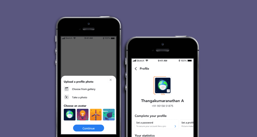
Post-tutorial, users could log in via phone number or use Truecaller for quick access. Later, we also added Google/Facebook Import for profiles.
Post-tutorial, users could log in via phone number or use Truecaller for quick access. Later, we also added Google/Facebook Import for profiles.
Post-tutorial, users could log in via phone number or use Truecaller for quick access. Later, we also added Google/Facebook Import for profiles.
Post-tutorial, users could log in via phone number or use Truecaller for quick access. Later, we also added Google/Facebook Import for profiles.

Users could log in with password or OTP after entering their phone number. OTP-only verification may be implemented based on future data.
Users could log in with password or OTP after entering their phone number. OTP-only verification may be implemented based on future data.
Users could log in with password or OTP after entering their phone number. OTP-only verification may be implemented based on future data.
Users could log in with password or OTP after entering their phone number. OTP-only verification may be implemented based on future data.

We added a password login screen with a "forgot password" button for easy reset. To proceed, users must verify their phone number with an OTP.
We included a password login screen and a "forgot password" button for easy reset, which requires users to verify their phone number with an OTP before proceeding.
We added a password login screen with a "forgot password" button for easy reset. To proceed, users must verify their phone number with an OTP.
We included a password entry screen and "forgot password" button for easy reset, which requires users to verify their phone number with an OTP before proceeding.
We included a password login screen and a "forgot password" button for easy reset, which requires users to verify their phone number with an OTP before proceeding.

We solved the issue of users without an Indian phone number being unable to log in by implementing a universal solution for app access.
We resolved the issue of users without an Indian phone number being unable to login by introducing a solution that allows anyone to access the app.
We solved the issue of users without an Indian phone number being unable to log in by implementing a universal solution for app access.
We resolved the issue of users without an Indian phone number being unable to log in by implementing a solution that allows anyone to access the app.
We resolved the issue of users without an Indian phone number being unable to login by introducing a solution that allows anyone to access the app.
Challenges Faced
Challenges Faced
Challenges Faced
During the design of onboarding we had already designed few interfaces, but incorporating all the necessary elements into a bottom sheet while still making the new UI familiar to users was a significant obstacle.
The goal was to create an onboarding process that not only introduces users to the new UI but also helps them understand the features of our app.
Another major challenge I faced was educating people about the Yulu model and how to use our vehicles. To resolve this we providing clear and concise information to users to help them understand how our service works and how to use it effectively.
As a team, we faced a significant challenge with animations because we were still getting familiar with Lottie files. Lottie animations convert animations to .json format which is very small in size hence reduced the load on the app
Another challenges we faced was aligning what other teams wanted to include in the onboarding process, while still ensuring that the process was streamlined and user-friendly. We wanted to provide users with all the necessary information that stakeholder might want for onboarding, but we also knew that cluttered screens and unnecessary elements could negatively impact the user experience.
Learnings & Conclusion
Learnings & Conclusion
Learnings & Conclusion
A user-flow is very important for any feature or product - no matter how big or small
A user-flow is very important for any feature or product - no matter how big or small
A user-flow is very important for any feature or product - no matter how big or small
A user-flow is very important for any feature or product - no matter how big or small
As someone who was just getting started with Product Design and had only completed one other project prior to this, I realized the importance of user flow. By having all possible user flows for the feature available, anyone can easily understand what is being done in a comprehensive manner and can figure out where to add new features without interrupting the flow.
As someone who was just getting started with Product Design and had only completed one other project prior to this, I realized the importance of user flow. By having all possible user flows for the feature available, anyone can easily understand what is being done in a comprehensive manner and can figure out where to add new features without interrupting the flow.
As someone who was just getting started with Product Design and had only completed one other project prior to this, I realized the importance of user flow. By having all possible user flows for the feature available, anyone can easily understand what is being done in a comprehensive manner and can figure out where to add new features without interrupting the flow.
Research, research & collaboration
Research, research & collaboration
Research, research & collaboration
Research, research & collaboration
There is no definite way to determine how much quantity and quality of research should be done before launching a feature, and no matter how much research you do, you may still fall short. Our team was very small, and since every feature was critical and needed to be launched as soon as possible, learning how to talk to users, form research questions, and gather feedback was eye-opening for me. I was happy to conduct the research as it made me realise that I may be making our users lives easier, even if it's only a small amount.
There is no definite way to determine how much quantity and quality of research should be done before launching a feature, and no matter how much research you do, you may still fall short. Our team was very small, and since every feature was critical and needed to be launched as soon as possible, learning how to talk to users, form research questions, and gather feedback was eye-opening for me. I was happy to conduct the research as it made me realise that I may be making our users lives easier, even if it's only a small amount.
There is no definite way to determine how much quantity and quality of research should be done before launching a feature, and no matter how much research you do, you may still fall short. Our team was very small, and since every feature was critical and needed to be launched as soon as possible, learning how to talk to users, form research questions, and gather feedback was eye-opening for me. I was happy to conduct the research as it made me realise that I may be making our users lives easier, even if it's only a small amount.
MVP is the king
MVP is the king
MVP is the king
MVP is the king
The minimum viable product is king. I say this because I used to strive for perfection and wanted every idea I could think of to be incorporated. However, I soon realised that putting something out there is better than nothing being out there. Trying to achieve perfection will never let you ship products or features. It's better to learn as you go and iterate as needed.
The minimum viable product is king. I say this because I used to strive for perfection and wanted every idea I could think of to be incorporated. However, I soon realised that putting something out there is better than nothing being out there. Trying to achieve perfection will never let you ship products or features. It's better to learn as you go and iterate as needed.
The minimum viable product is king. I say this because I used to strive for perfection and wanted every idea I could think of to be incorporated. However, I soon realised that putting something out there is better than nothing being out there. Trying to achieve perfection will never let you ship products or features. It's better to learn as you go and iterate as needed.
Content is as important as research
Content is as important as research
Content is as important as research
Content is as important as research
Crafting an experience that is good enough to be used by people requires good content design as well. The content design should capture the emotional aspect of talking to people through a screen. This project has taught me that even error messages have to be well-crafted and should be direct and simple in a way that people can understand. Even using a word such as "invalid" can make a big difference.
Crafting an experience that is good enough to be used by people requires good content design as well. The content design should capture the emotional aspect of talking to people through a screen. This project has taught me that even error messages have to be well-crafted and should be direct and simple in a way that people can understand. Even using a word such as "invalid" can make a big difference.
Crafting an experience that is good enough to be used by people requires good content design as well. The content design should capture the emotional aspect of talking to people through a screen. This project has taught me that even error messages have to be well-crafted and should be direct and simple in a way that people can understand. Even using a word such as "invalid" can make a big difference.
Working on this project was emotionally challenging for me. Many times during the process of creating the onboarding experience, I felt nervous, excited, and anxious. I was still learning everything design-related, and getting to work on this project overwhelmed me. Avoiding perfection was a major challenge, but I learned a lot through the developer handoff, brainstorming sessions, and working on the user interface in addition to research and improving the experience. I am thankful to my team and everyone involved in making this a reality and letting thousands of people use what we made for them.
Working on this project was emotionally challenging for me. Many times during the process of creating the onboarding experience, I felt nervous, excited, and anxious. I was still learning everything design-related, and getting to work on this project overwhelmed me. Avoiding perfection was a major challenge, but I learned a lot through the developer handoff, brainstorming sessions, and working on the user interface in addition to research and improving the experience. I am thankful to my team and everyone involved in making this a reality and letting thousands of people use what we made for them.
Working on this project was emotionally challenging for me. Many times during the process of creating the onboarding experience, I felt nervous, excited, and anxious. I was still learning everything design-related, and getting to work on this project overwhelmed me. Avoiding perfection was a major challenge, but I learned a lot through the developer handoff, brainstorming sessions, and working on the user interface in addition to research and improving the experience. I am thankful to my team and everyone involved in making this a reality and letting thousands of people use what we made for them.
See more work
See more work
See more work
See more work